Wine Label
TOPIC:
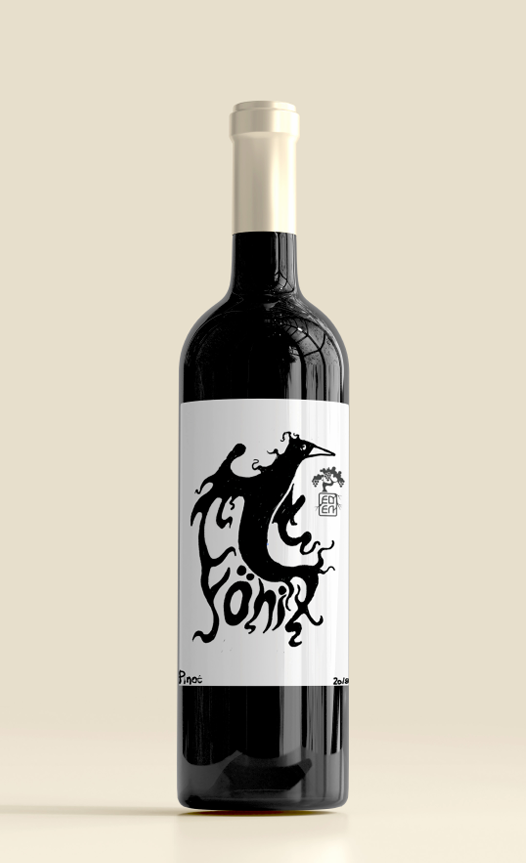
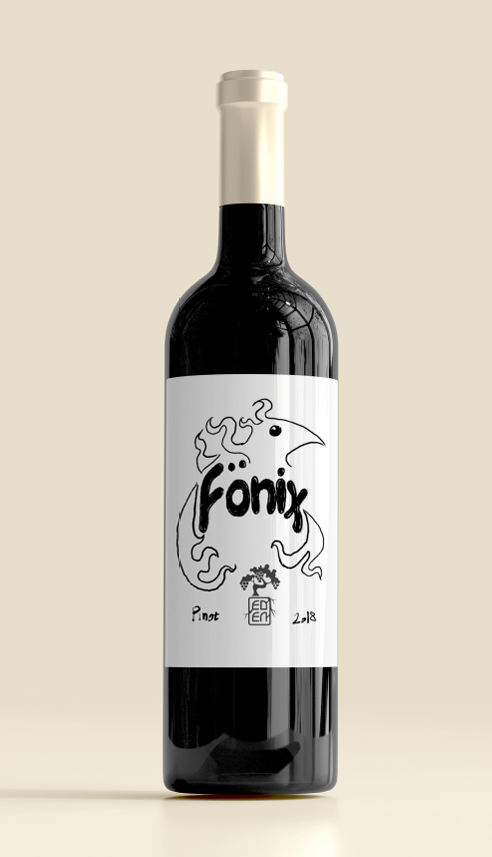
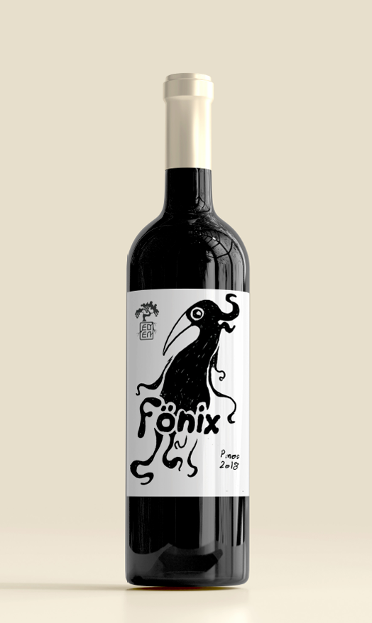
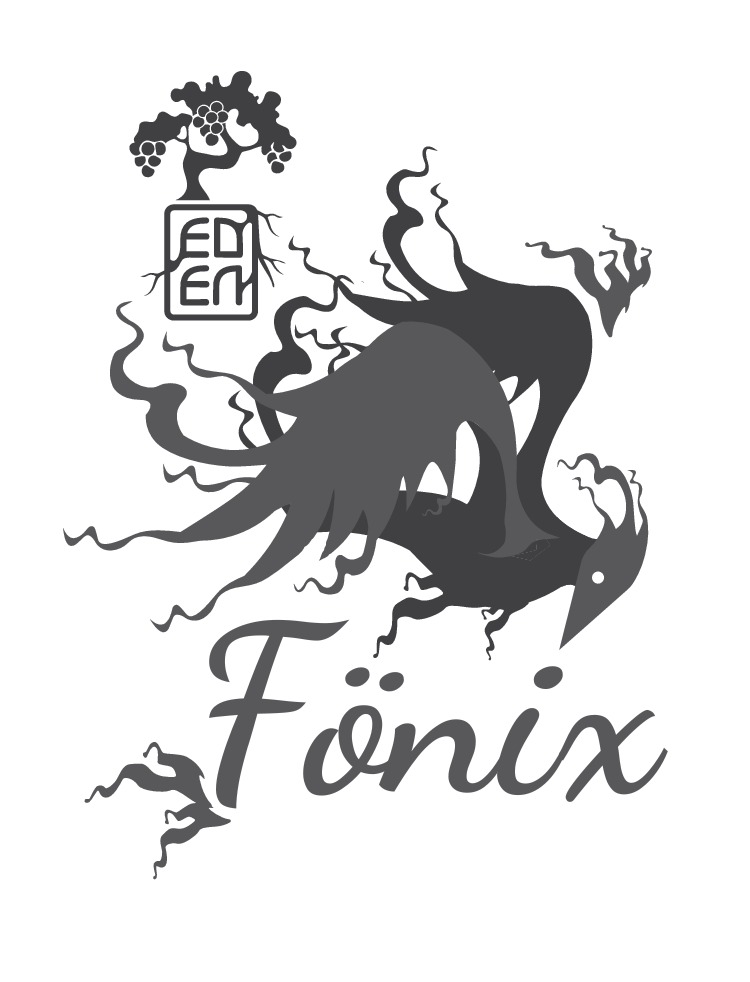
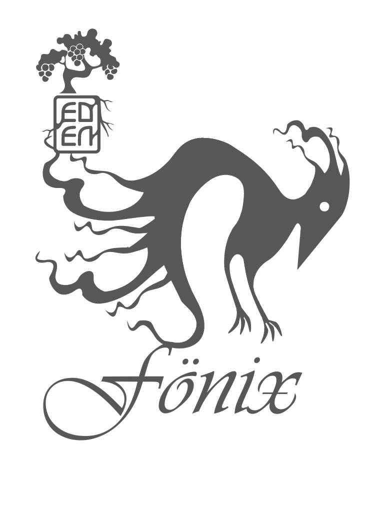
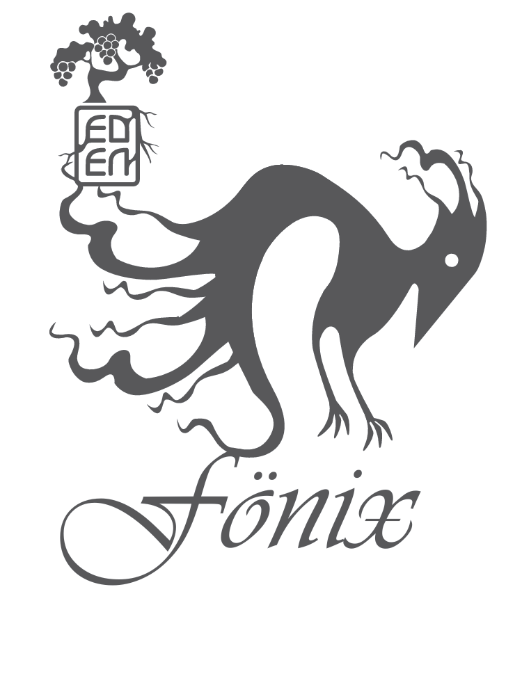
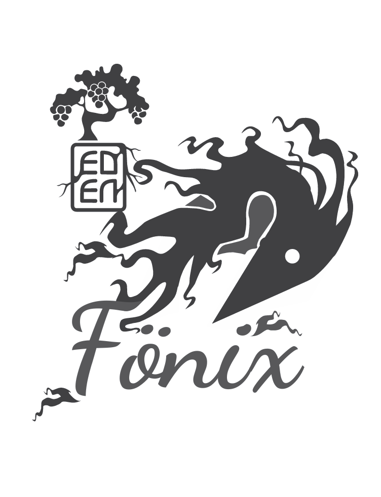
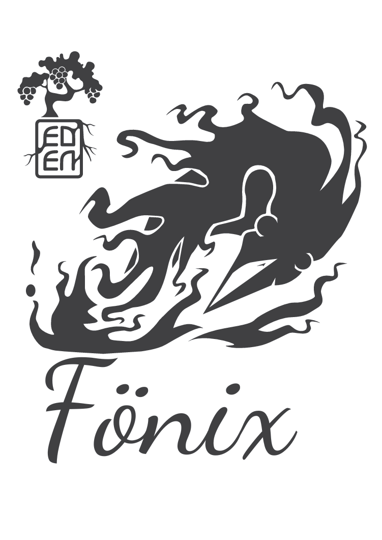
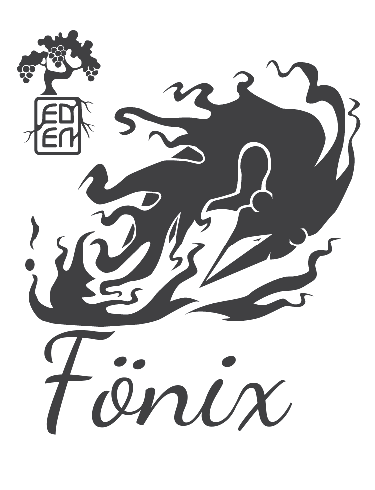
Fonix Label
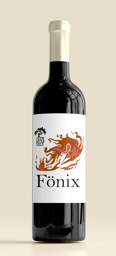
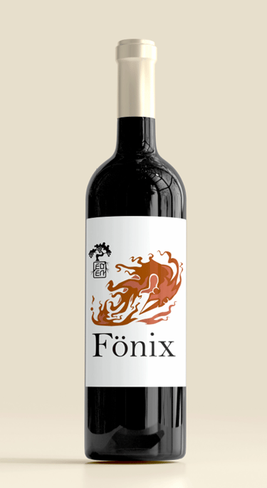
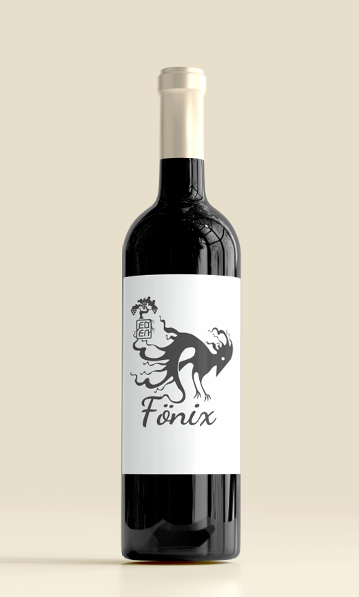
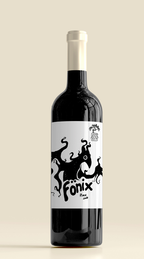
A series of labels built around hand-inked phoenix forms that suggest smoke and flame, paired with clean typography to balance energy and restraint.
Variations test tone—serif vs. script wordmarks, stark black/white versus warm ember gradients—while a consistent layout, crest, and generous white space keep the family unified. The system scales by swapping illustration and type for varietal/vintage lockups (e.g., Pinot 2018) and is shown on-bottle for production context.
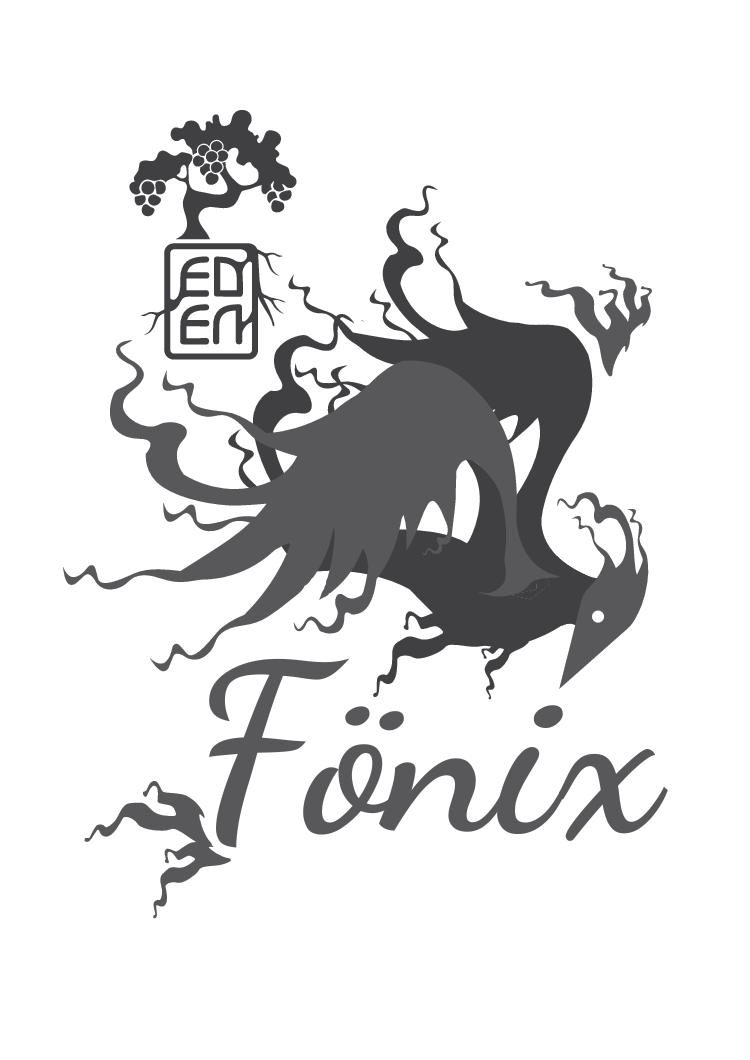
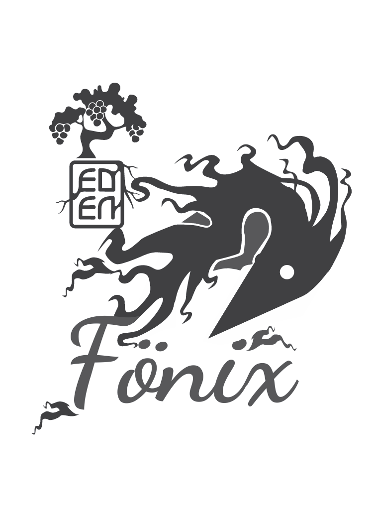
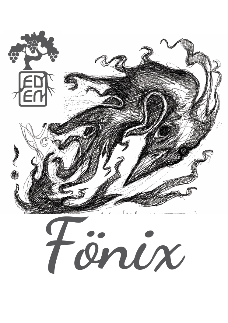

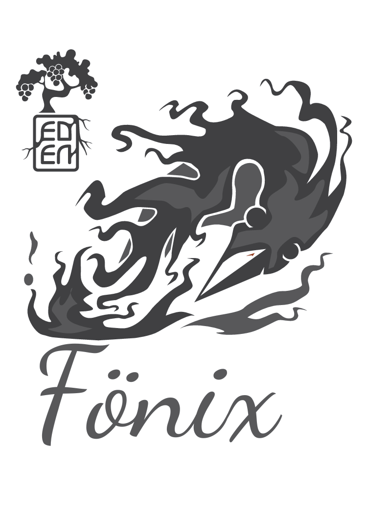
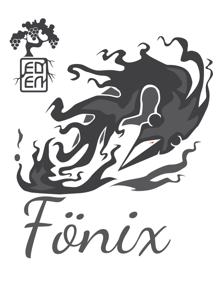
From sketch to vector
The phoenix began as loose ink thumbnails, then was refined into a crisp vector master—redrawn with clean Bézier curves to keep the brush energy while optimizing for print. I simplified anchor points, balanced stroke weights, and set spot-color layers so the artwork scales cleanly on bottle and adapts to different wordmarks and vintages.